Project Creating a new standout experience
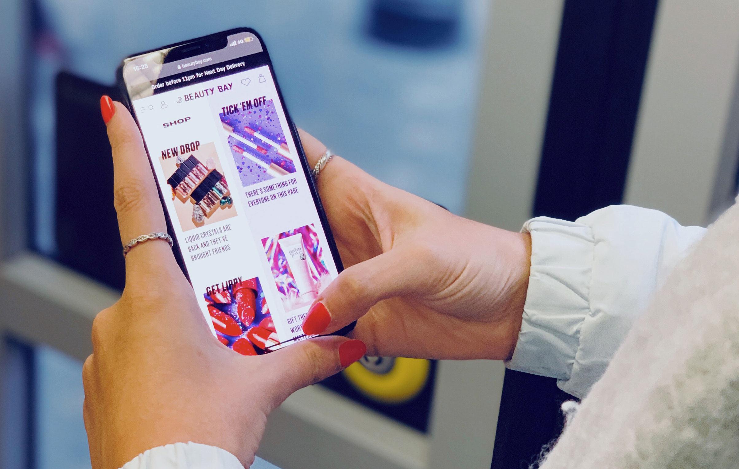
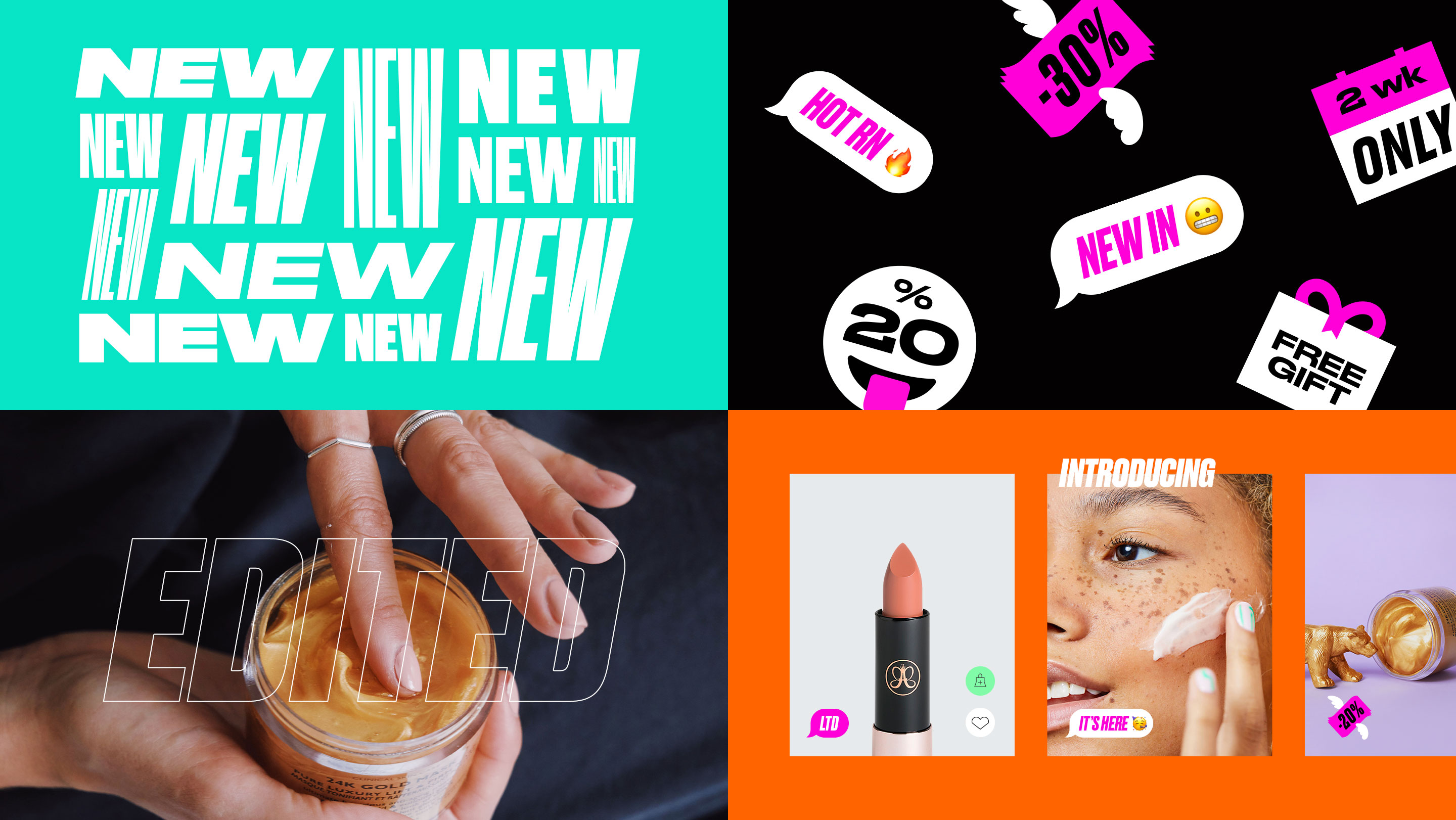
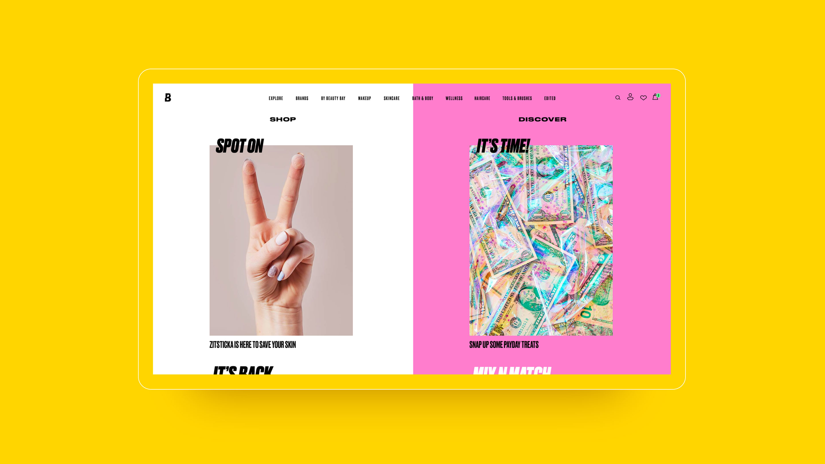
Creating a new standout experience is no longer enough for brands to stand out, they have to stand for something. That ethos helped us pinpoint Beauty Bay’s positioning and shape their digital identity.
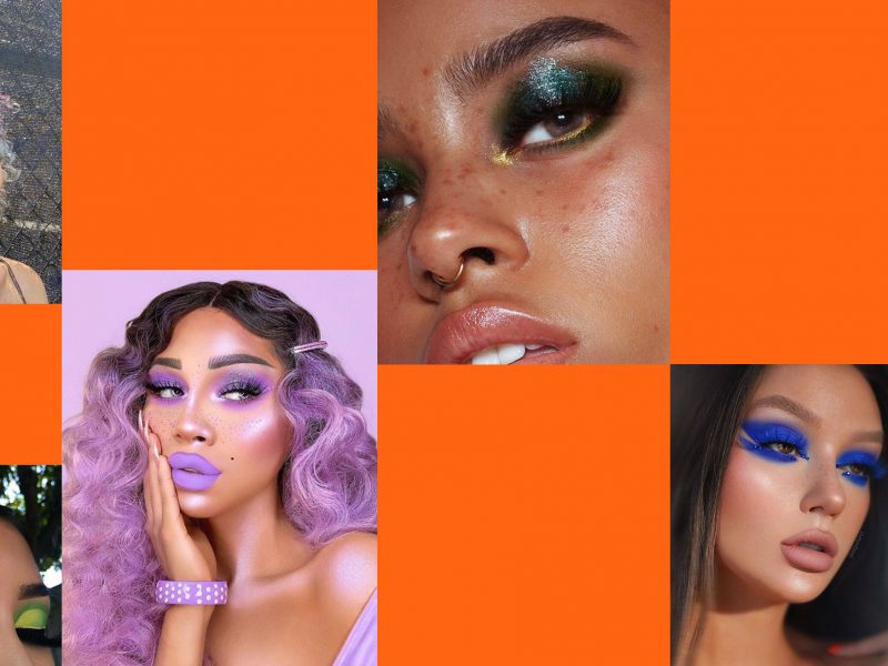
Beauty Bay needed a digital experience that broke the rules, just like the brand.
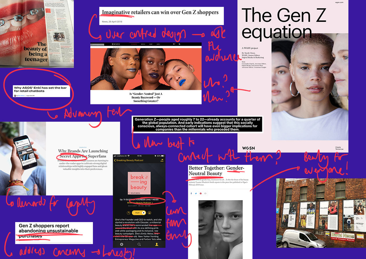
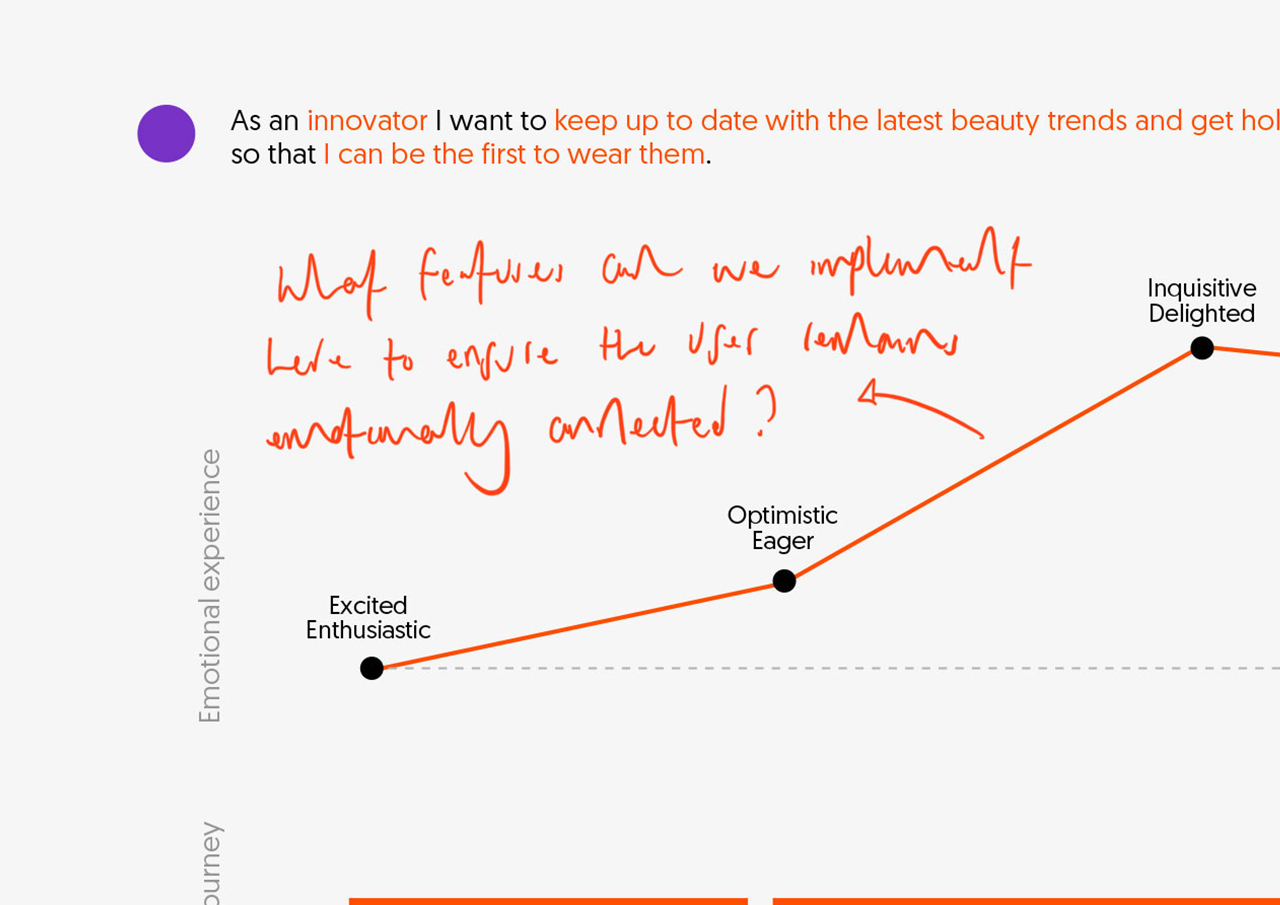
Putting the user first
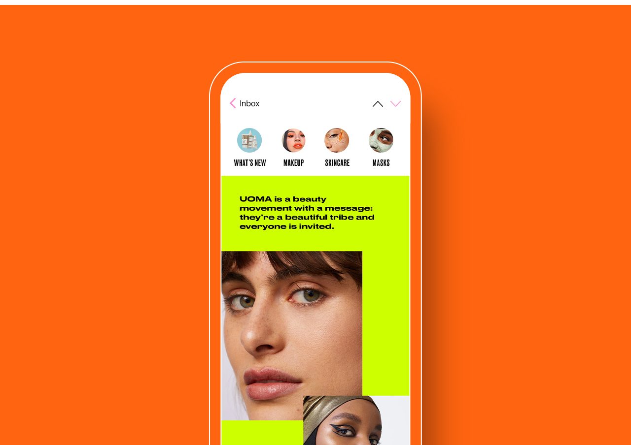
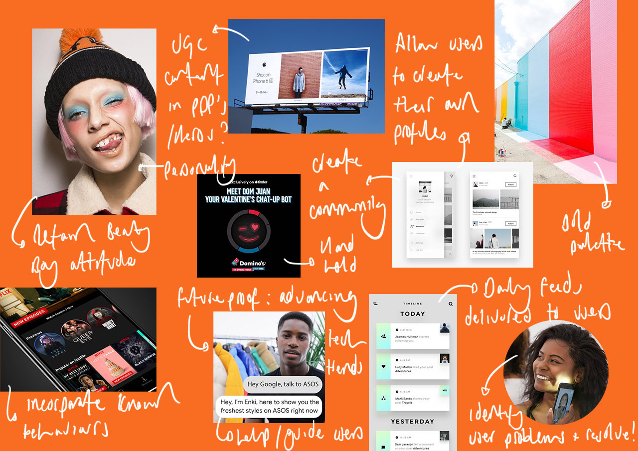
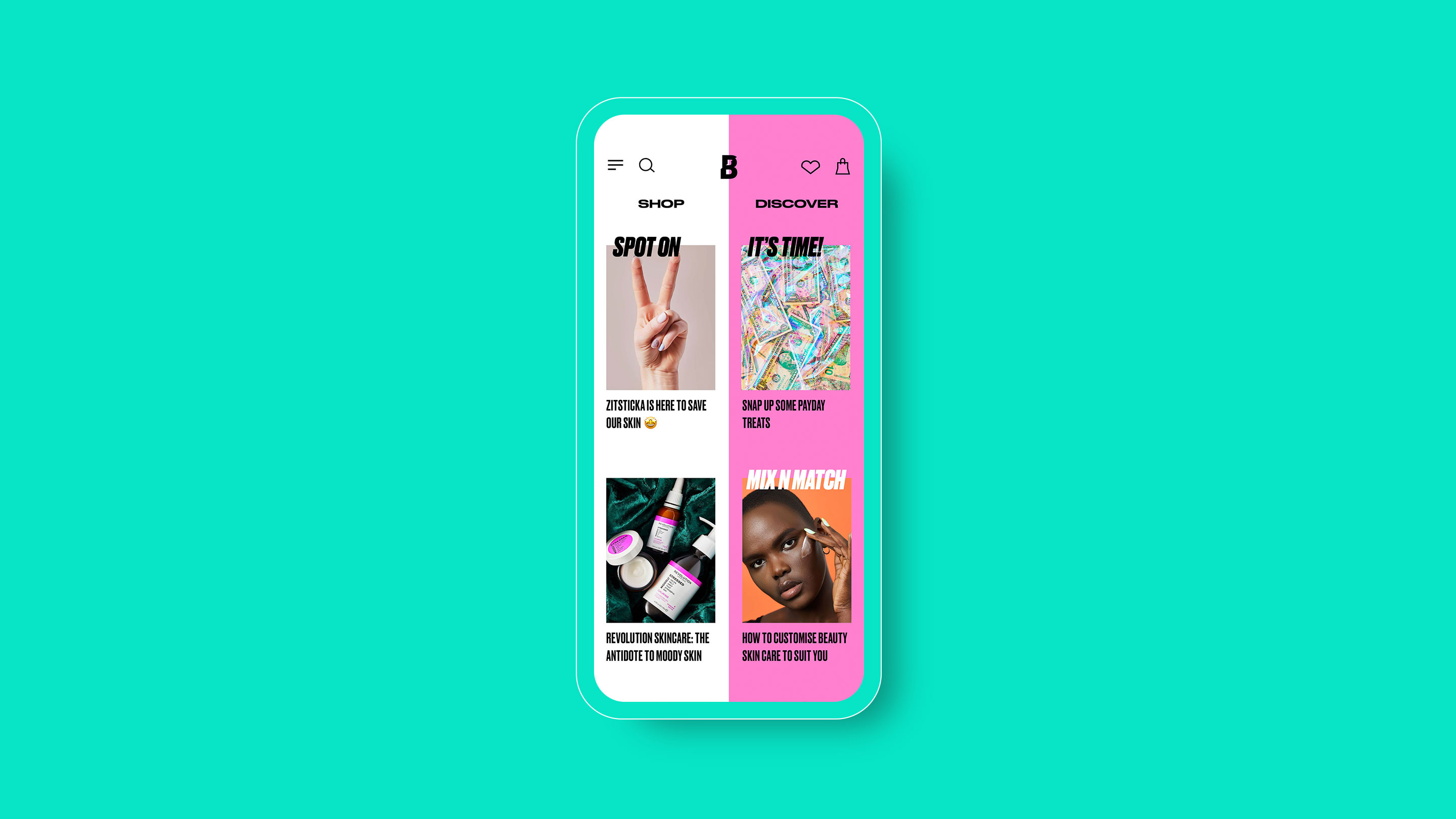
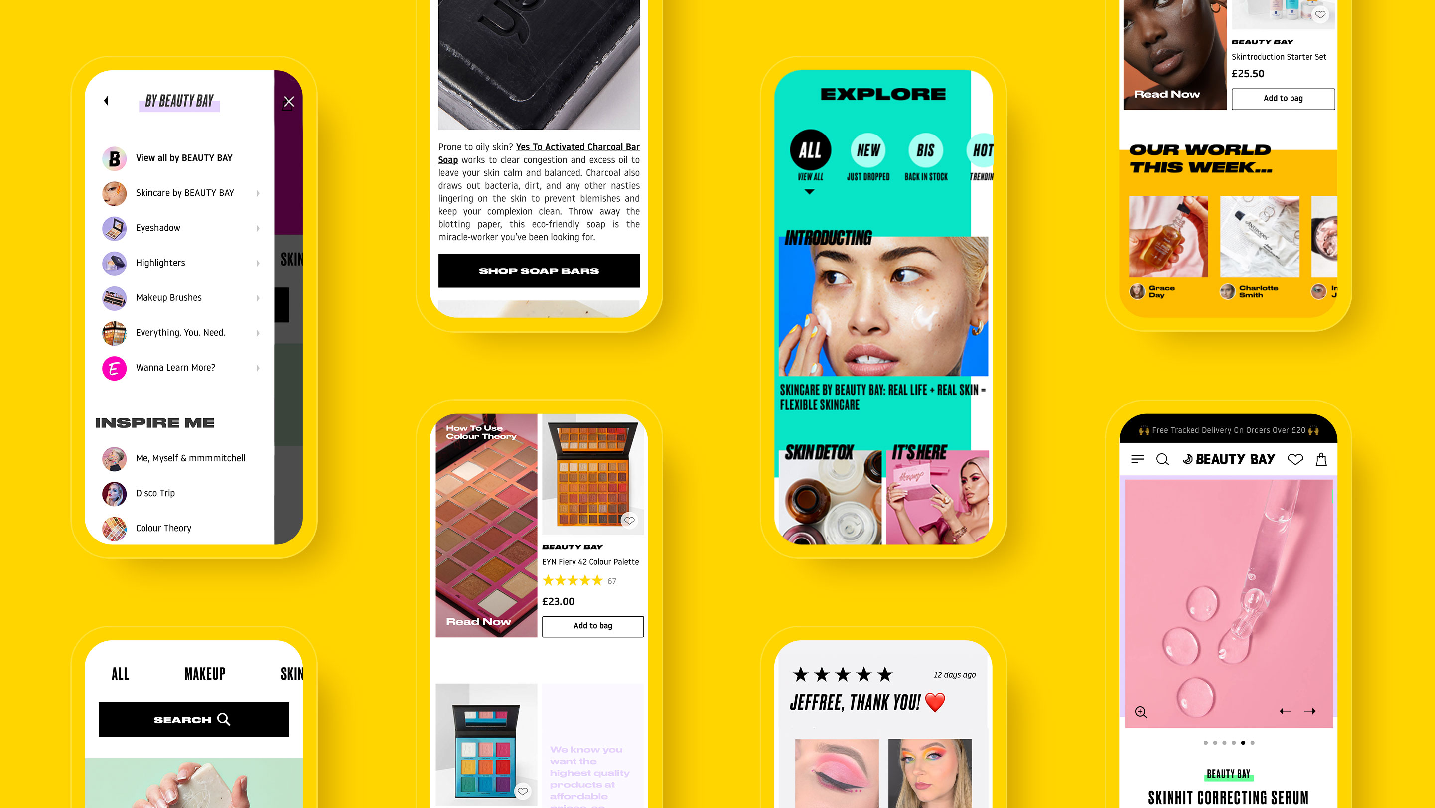
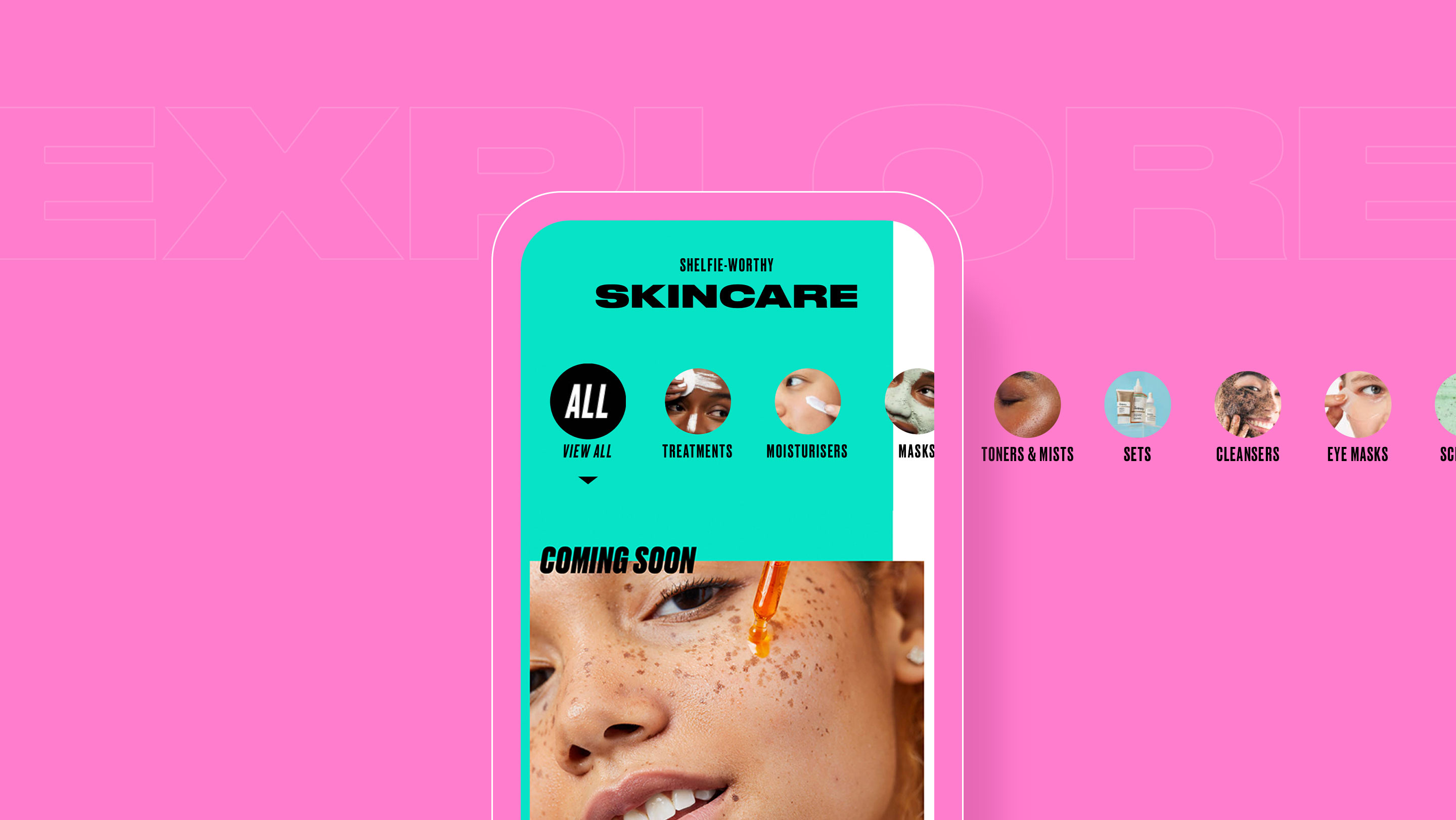
Drawing on wider inspiration, we created something brand new for the sector: a destination with user needs front and centre. A place for beauty enthusiasts to be inspired, feel informed and find their products; and most of all, a place they’d want to keep coming back to.
Andy and the team provided a critical extension of our internal capability to deliver this project. Having initially taken care and attention to understand who we were, and our vision for the platform we set about working together to come up with something bold, exciting, and disruptive without compromising on customer experience. The end result has surpassed any of our expectations for what we hoped to could achieve. Without the expertise and capability, MERó brought to the table, we couldn’t have achieved what we have in such a short timescale. We look forward to working closely with MERó to continue to evolve this vision and to ensure that BEAUTY BAY continues to stay at the bleeding edge of E-Commerce.
Beauty Bay Digital Nik Southworth, Chief Technology Officer
Balancing ‘why’ with ‘buy’
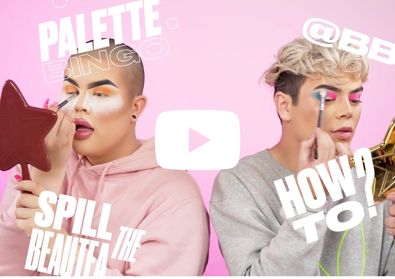
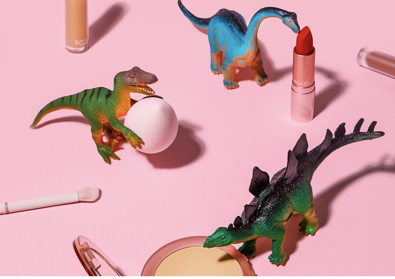
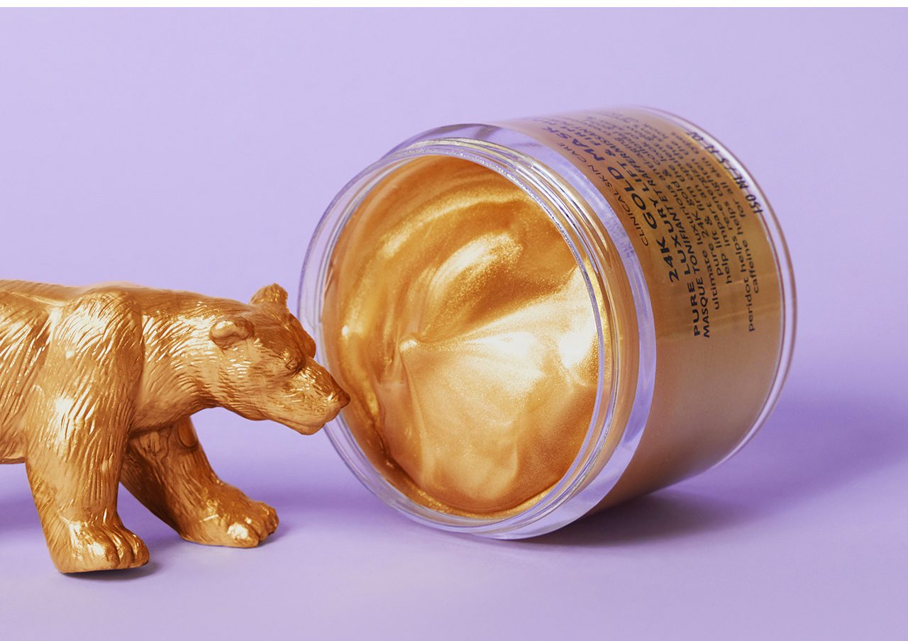
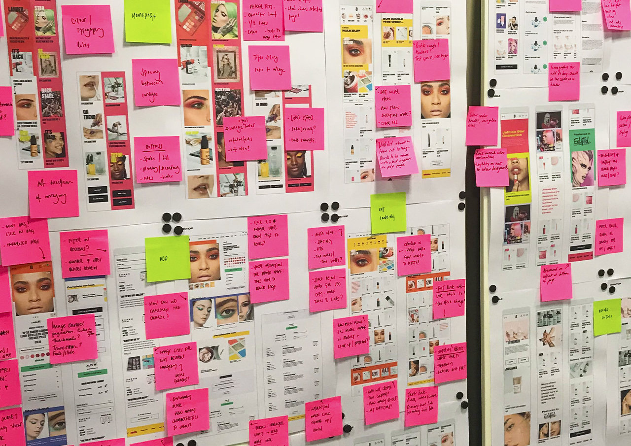
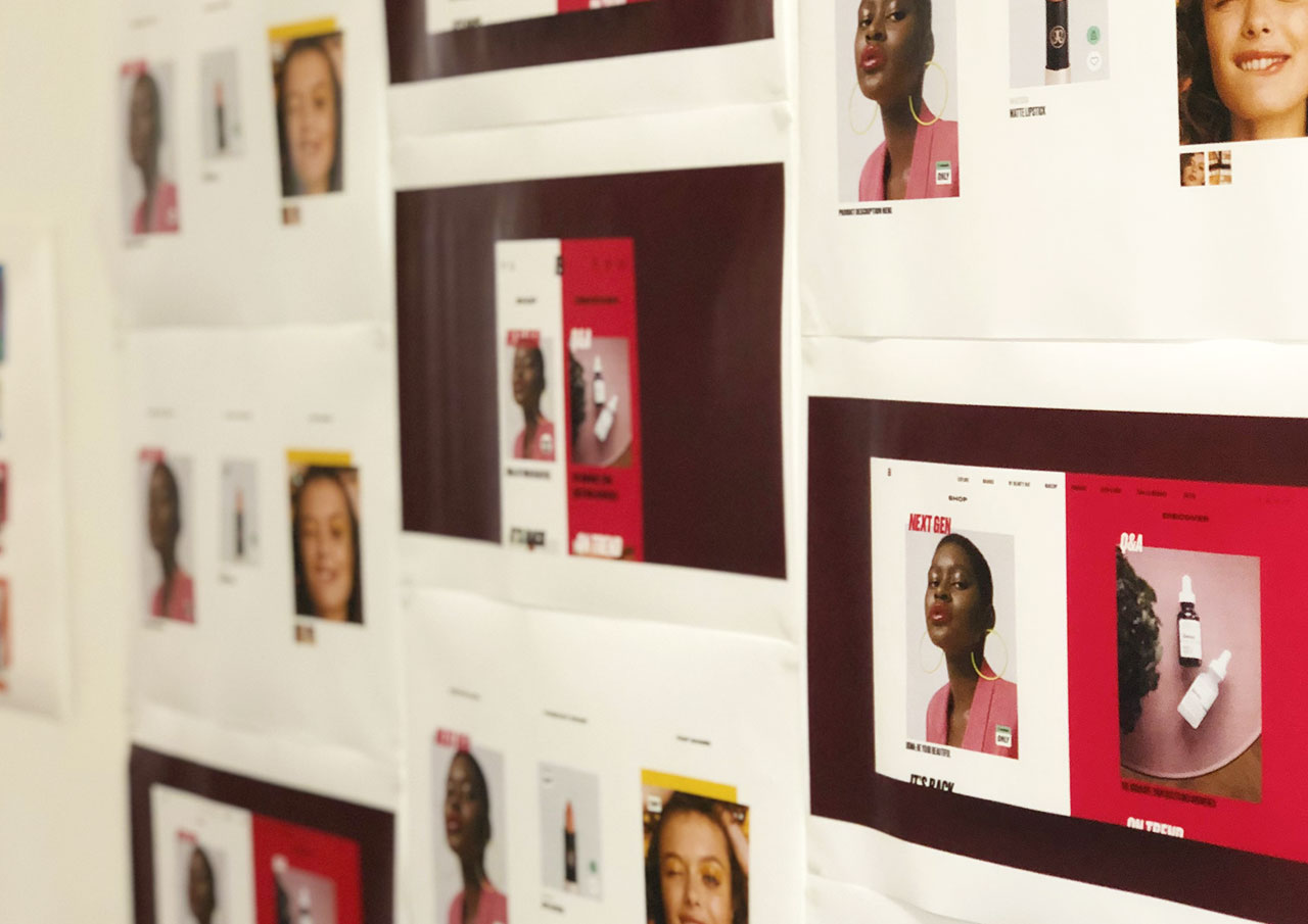
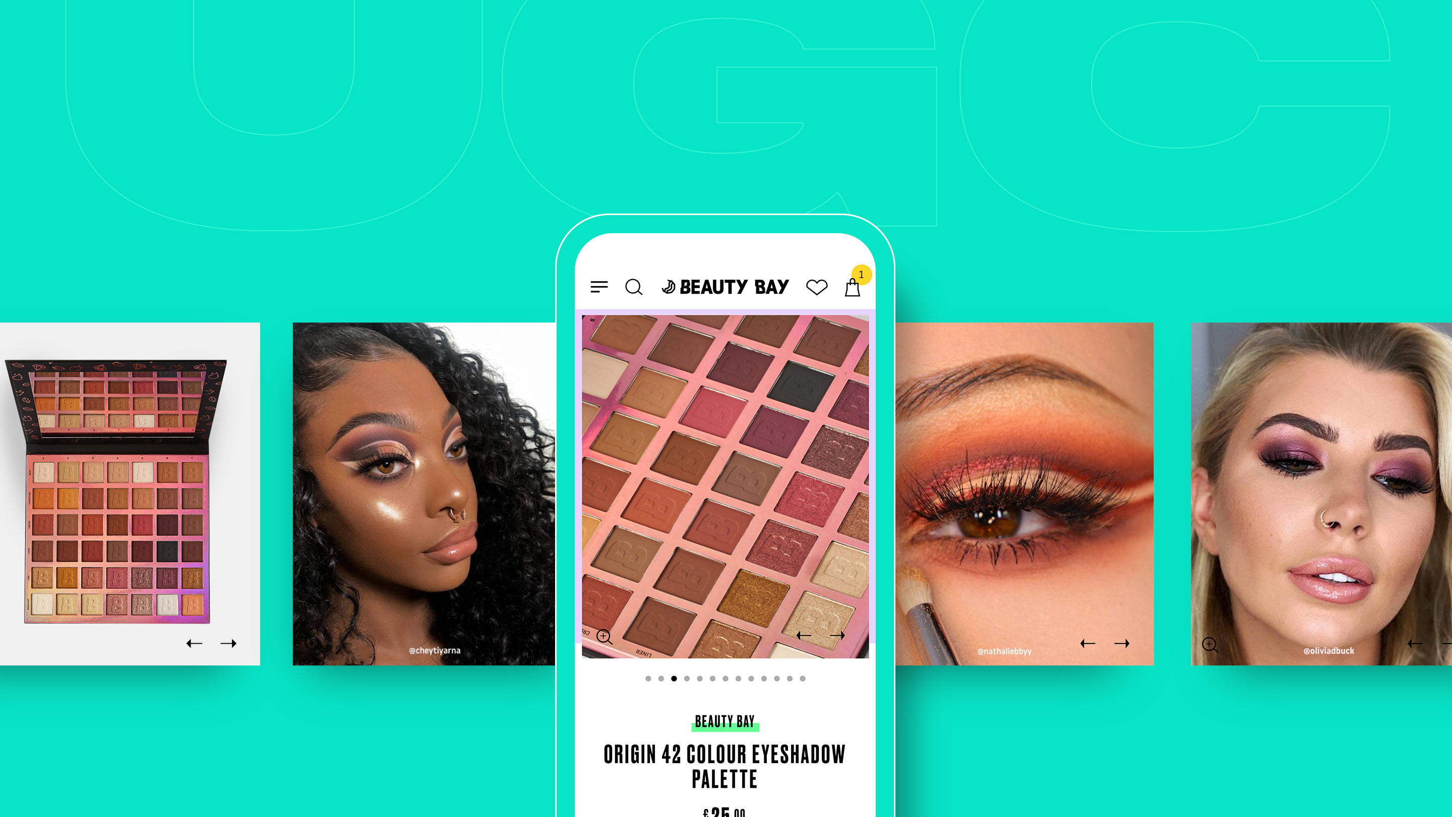
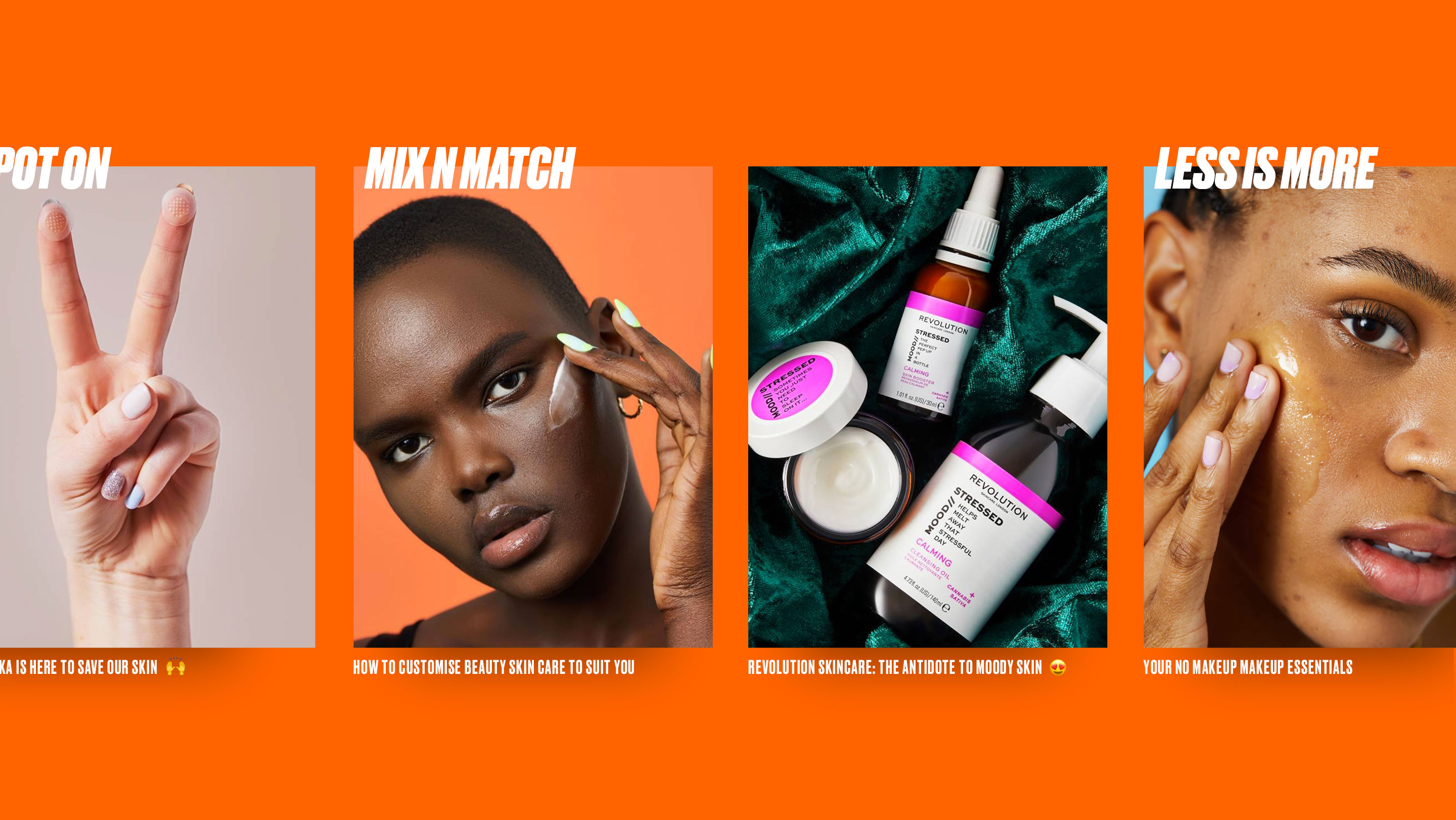
Working with the audience showed how valuable editorial content was when placed alongside product, so we made sure the two were complementary throughout the design. The devil in the detail - colour palettes, font families and image style guides - tied it all together, giving the team at Beauty Bay and their millions of followers all they need to stay ahead of their competition.
