They’re being dubbed as more influential than Millennials and have an estimated spending power of £109 billion — so how are digital designers upping their game to grab the attention of the all-powerful Gen Z?
It’s all change again for the digital design industry working with brands that need to appeal to the two billion ‘Gen Z-ers’ worldwide — a generation of digital natives who could pinch and swipe before they learned to talk and who are now entering the workforce. For some brands, digital design that worked, even for Millenials, is now obsolete. Generation Z is demanding a different approach.
Here are our five key take-outs of designing for Gen Z.
1. Create empowering, explorative design for a self-reliant generation
Our own research into this audience supports other industry findings that they have a strong level of self-direction. Having held the answer to almost any question in the palm of their hands from the day they were born, they’re able to find whatever they want without the help of intermediaries. Self-reliant and innovators — they’re fuelled by their experiences (good or bad) and able to affect change through the digital spaces they occupy.
Design is, therefore ‘empowering’ for this audience; and design presented in such a way, as to encourage personal growth and the capacity to shape their surroundings, clearly resonates with them.
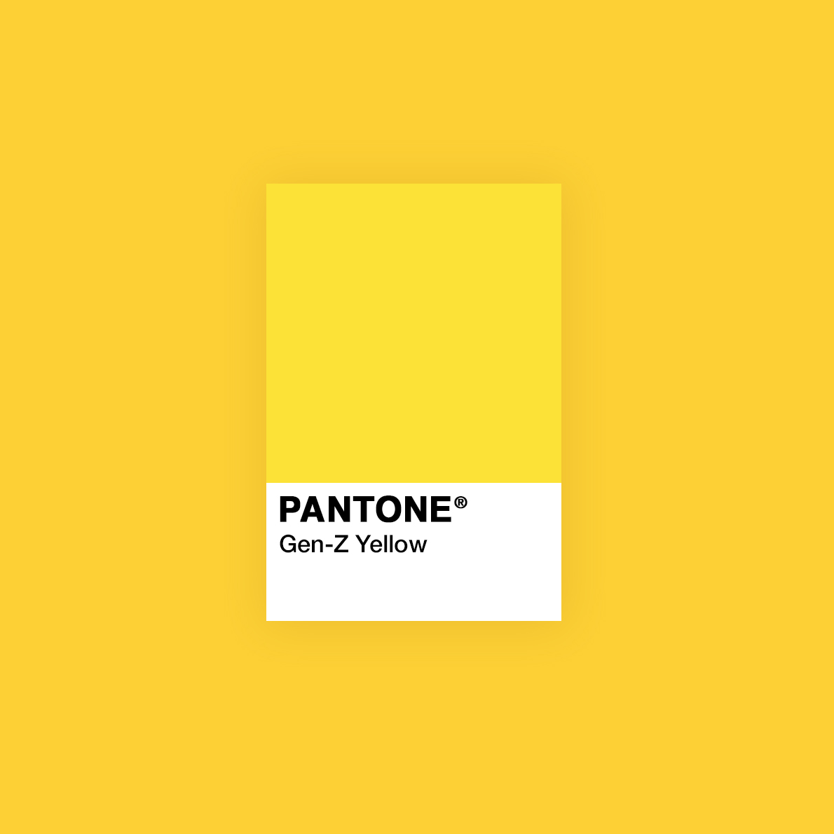
Because they’re innovative ‘unique-seekers’, Gen Z is also a cohort that pushes boundaries. This can be really exciting for designers. Imagery can be experimental, colours — confident and clashing — they even have their own colour, Gen Z yellow.
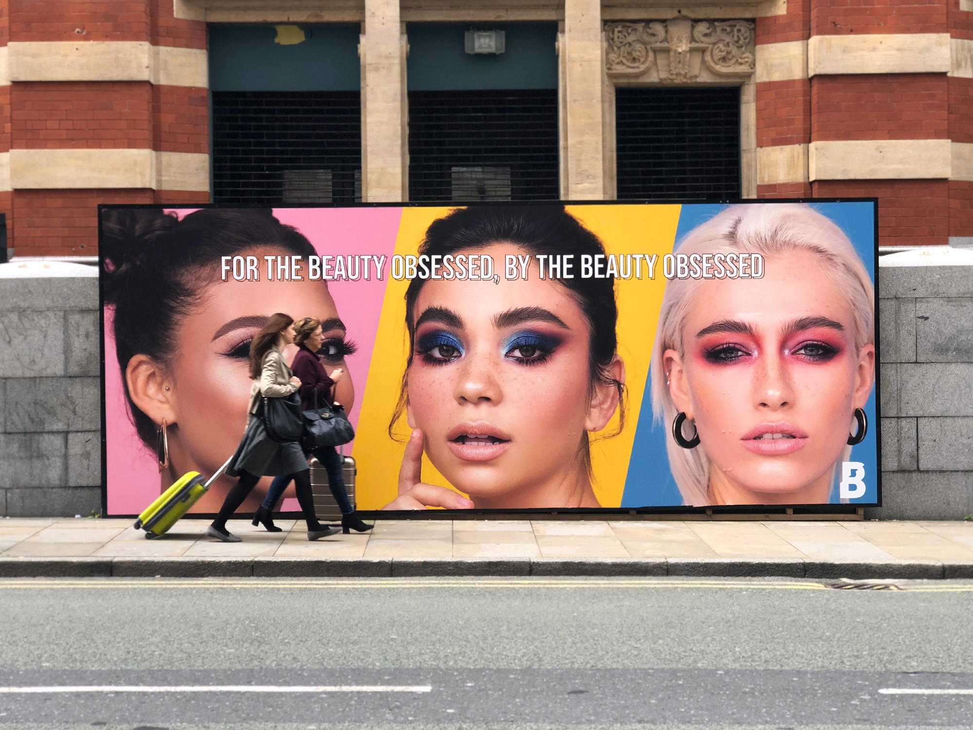
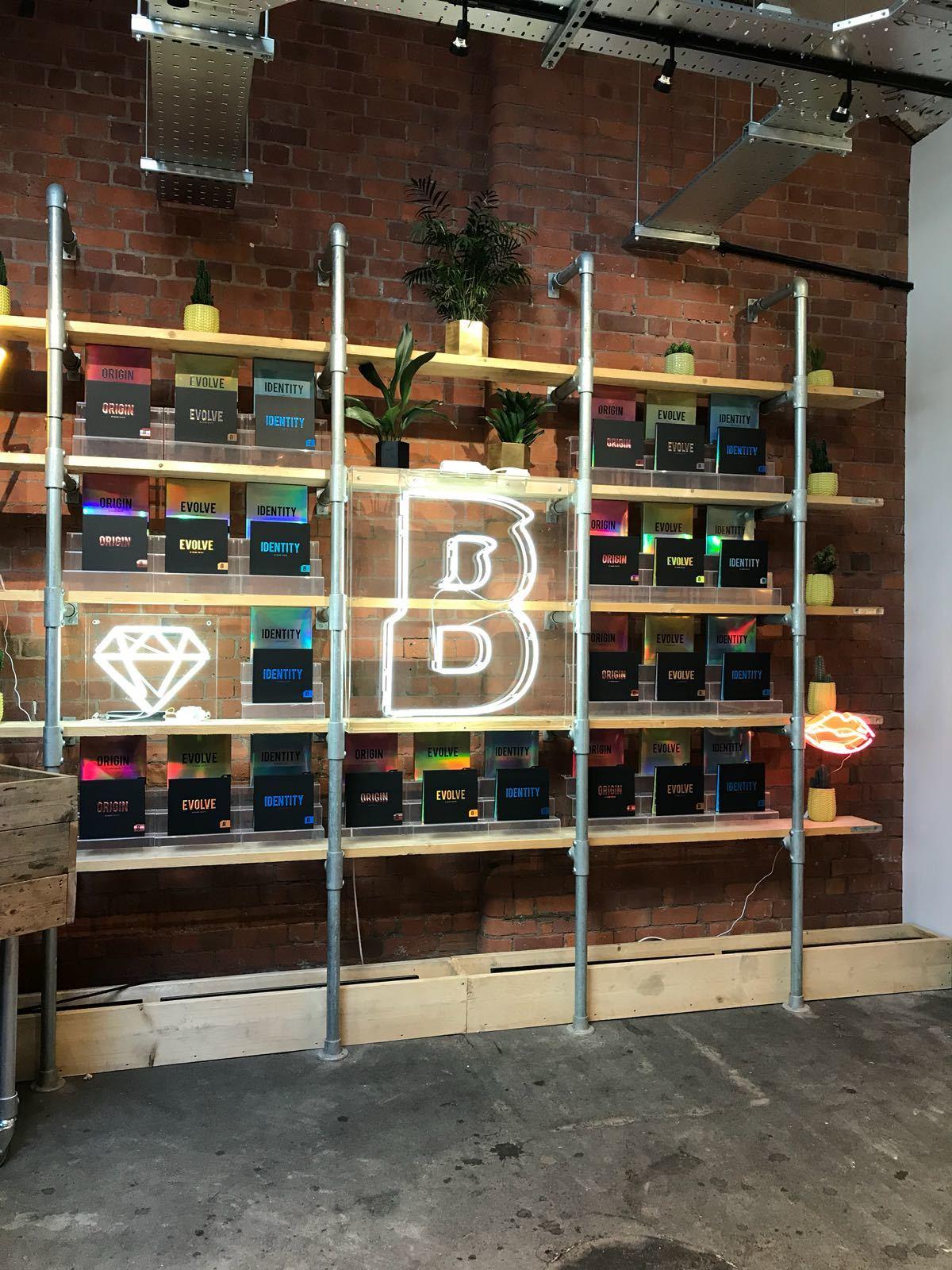
There’s scope to exploit the ‘unexpected’ through design; a concept we explored during a recent rebrand of online beauty destination, Beauty Bay. In the developmental phase, we found a bold, challenger proposition of ‘Breaking the Rules’ resonated most with the fearless and experimental Gen Z audience.
The aim was to challenge the traditional idea of what a beauty brand should look like and seeing how far we could push the idea was all part of the fun.

Our experience with Gen Z on this project also proved that it’s not just about pictures — key words need to form part of the brand guidelines to peak their curiosity.
And another strong theory worked: if it demands your attention, it will do the same for Gen Z, cutting through their cluttered digital landscape.
But designing for Gen Z is not just about making things look appealing — it must be about how a brand allows them to live their lives with efficiency. Digital design that delivers a slick online experience is the only way to engender their loyalty. Design needs to be as digitally intuitive as they are. Similarly, design without function does not cut it with this audience.
Content needs to translate from online to offline and across all social channels. All content needs to be scalable, and, often overlooked, even ensuring fonts are available for digital and legible on mobile is a must. Ensure designs work in the smallest of digital spaces first then scale them upwards and outwards — not forgetting that creative often still needs to work offline.
2. A need for flexible branding
Gen Z want to align themselves with people, brands and causes that reflect their desired identities — that they self-control through social channels and online personas.
Sounds easy, but bear in mind that everything is fluid in the world of Gen Z. Research has shown that this generation is open-minded and diverse, but identity is dynamic. There is often no defined snapshot of a Gen Z ‘personality’, they don’t see themselves as occupying one over-riding defined role or trait.
Brand identities are of course created at a moment in time and are created to deliver consistency. But this means they (can) date easily — particularly when competing against the almost daily influx of fresh new brands designed more recently for a new generation’s needs — thus grabbing their attention. A brand created less than five years ago can feel very dated now. This doesn’t mean that all brands need to totally reinvent themselves and their identities, but it can mean branding needs to be refreshed more frequently.
Brand flexibility is now needed to stay ahead. Implementing a brand refresh, with a flexible system to stay current to the ever-changing Gen Z consumer, involves keeping a consistent brand identity, deep rooted in the brand’s values, but one that’s supported with a set of regularly updated brand guidelines that can flex with current trends and channels.
For example, this can be achieved by having a fixed primary brand colour palette, logo and typography style but creating seasonal / trend-led identity packs with a flexible palette of icons and colours to reflect ‘trends’. It’s a way of refreshing the brand in line with external influences while maintaining consistency and control. Branding can support campaign and imagery to greater affect; there is less disjoint when photography and visual assets need to move in another direction.
With a flexible identity system the whole brand can refresh without the need for a full rebrand.
3. Make it Sharable and Digestible
Gen Z has a perilously short attention span. In fact, if you’re a Gen Z, you’ve probably moved on to the next point already. The first cohort born into the digital age, Gen Z is accustomed to flitting between numerous screens. They’re more easily distracted than any of their predecessors. If brands thought grabbing audience attention was tough before — Gen Z has taken this to a whole new level.
The upshot of this is that Gen Z are quicker than any of their predecessors to decide if something is relevant to them. And they’re quick to abandon brands that haven’t kept up with their pace.
To cater for their fast and flighty rules of engagement, the most effective approach is to design in their language. Short videos, image sequences, images with text overlays and quotes can help to cut through the noise. Legible typefaces that work across all media are a must to allow for ‘quick take outs’ and, as mentioned, vibrant, eye-catching colour combinations that twist convention.
Stereotypical design elements and imagery doesn’t resonate with this audience — they’re looking for fluidity across both gender and age. And don’t make the design feel younger than the target audience as they won’t engage with it.
Both images and language used can help to create an ‘instant’ emotional connection, increasing engagement. Gen Z wants content that feels real, personal, casual and informative.
And of course, the holy grail is to make everything instantly sharable. By utilising bite-size, sharable content there’s an opportunity to mobilise an army of hyper-connected social media natives who can amplify your brand like never before.

© 2018 Beauty Bay
4. Get them to prove what designs resonate
The digital age presents us with unrivalled opportunities to understand real-time consumer behaviour, both within a brand’s platform and social channels.
Not only does this mean designers no longer have to ‘hope’ that a design will resonate with a specific target audience when they put it live, based on assumption, it means it can be tested with real audiences and adapted as consumer behaviours change (and they will).
Understanding Gen Z’s nuances is crucial if you want to connect with them and deliver what they need at every touch point — whether that’s through your platform or Instagram. So ignore ongoing user testing at your peril. To be truly customer-centric in order to hit the sweet spot, the only way to really know if a design or feature will produce a positive reaction is to test it with real users in real time, then iterate based on these insights.
And don’t forget that what works for one brand competing for Gen Z’s attention might not necessarily work for another.
5. Use design to showcase a brand’s values
Introducing a new brand identity can revitalise a decades-old business but with this generation, more so than others, the new identity must still reflect the brand ethos. If a brand is trying to be something it’s not — Gen Z will soon see through this. Similarly, claims must have substance. Gen Z are quick to call out brands that aren’t authentic. And through social media they have an authoritative voice and means to do this.
The challenge for established brands implementing a brand update to appeal to younger audiences is how to remain true to core values, making the new brand part of the organisation’s DNA.
To succeed in this area of design, explore the business, its culture as well as the audience in great detail. Any brand revamp needs to work from the inside out with internal teams living and breathing the brand to convey this outwards. Hold live the brand workshops with staff and internal departments to find out what the company’s vision is and how this needs to be evolved to connect with Gen Z.
Success with Gen Z will come from being original, innovative and authentic, rather than a question of ‘who shouts the loudest’. Cater for their needs with empowering and intelligent design, coupled with a slick online experience (that works how it’s supposed to) and it shouldn’t be too difficult to engender their loyalty. For a short time at least.