
Since the launch of the first NATTER event, there has been curiosity about the branding, particularly the story behind the name ‘NATTER,’ the thought process behind the visual identity, and what inspired it. To satisfy this curiosity, Lee, the founder of NATTER, and I thought a blog would be a nice way to share that story.
A bit about NATTER before we get started
NATTER is a volunteer-driven design and UX community-based in Manchester focused on sparking change through conversation. It provides a supportive space where both newcomers and seasoned professionals in the industry can share knowledge and empower each other. At the heart of our community are monthly meetups, enhanced by various opportunities for engagement, including speaking, hosting, and volunteering. Covering a wide range of topics, from UX and UI design to leadership and career development, NATTER fosters a network of innovative thinkers and future leaders. The mission centers on inclusivity and support, offering a platform for everyone to grow, connect, and make their mark.
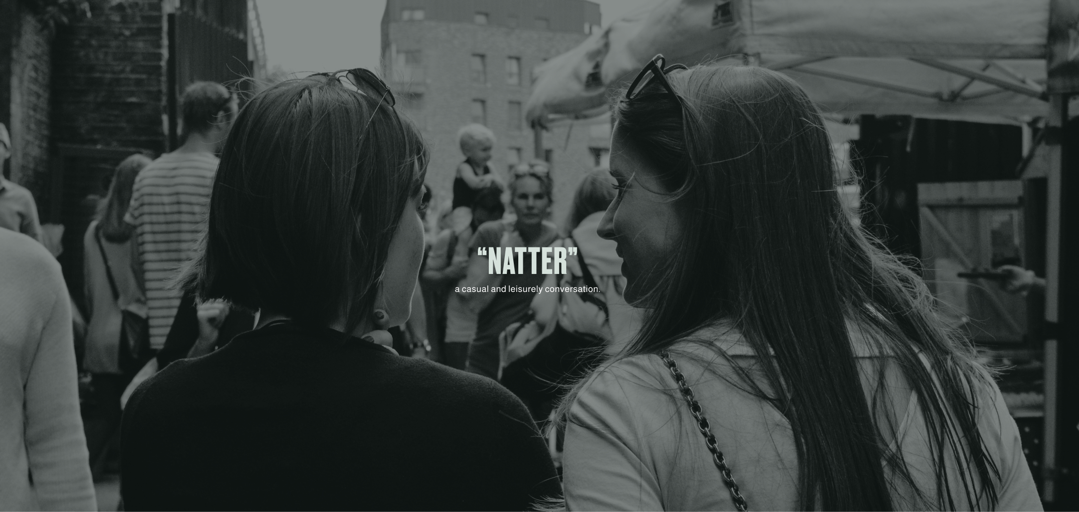
How the name was chosen
After a lot of thinking and chatting, we chose the name ‘NATTER,’ a word that’s both fascinating and welcoming. We felt it reflected our love for easy, friendly conversations that make you feel at home. We recognised that NATTER is more than just a name; it’s about creating memorable and engaging experiences, which was exactly what the new community was all about. It also brings a playful touch, suggesting a world full of great talks and connections. NATTER isn’t just about organizing events; it’s about building a lively, welcoming community filled with stories. It ticked every box for what we wanted in a name.
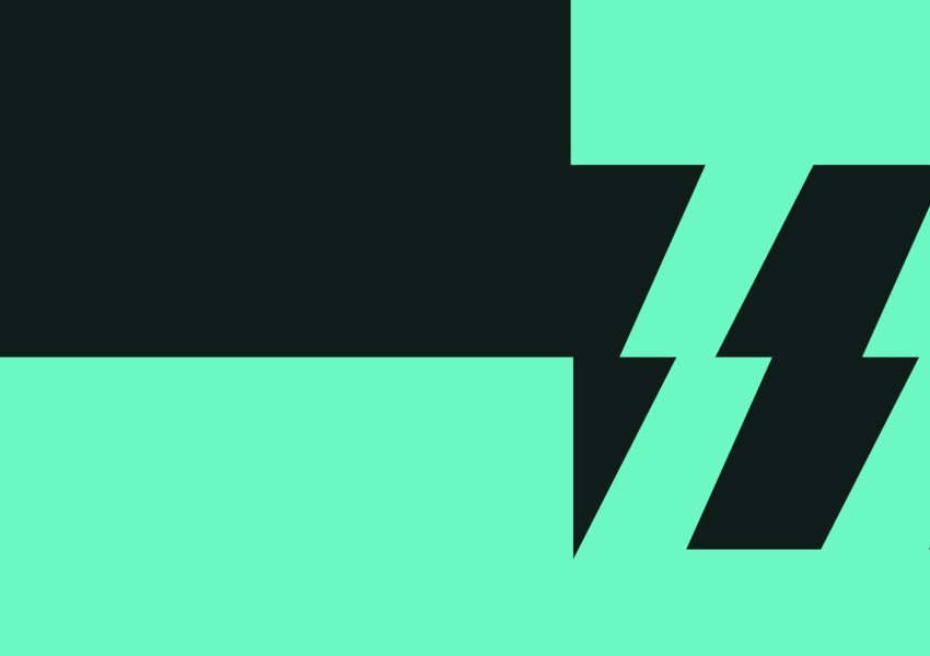
The two shapes come together and create the logo mark.
The thinking behind the identity
With ‘NATTER’ chosen as a name and deeply connected to Manchester, we aimed to create an identity that bridges the city’s rich heritage with its modern vibe. Our logo pays homage to both the spirit of conversation and Manchester’s transformation from an industrial powerhouse to a contemporary hub.
The logo is versatile, as shown by its different applications and use cases above.
The logo creatively forms the letter ’N’ using two speech marks facing each other, symbolising open dialogue and connectivity. The font and styling are deliberately selected to echo Manchester’s past, particularly the iconic mills, while embracing a modern aesthetic. This design effectively captures the dynamic nature of communication and adapts well to the diverse elements of the NATTER community, ensuring our story resonates across various contexts.
The logo is versatile, as shown by its different applications and use cases above.
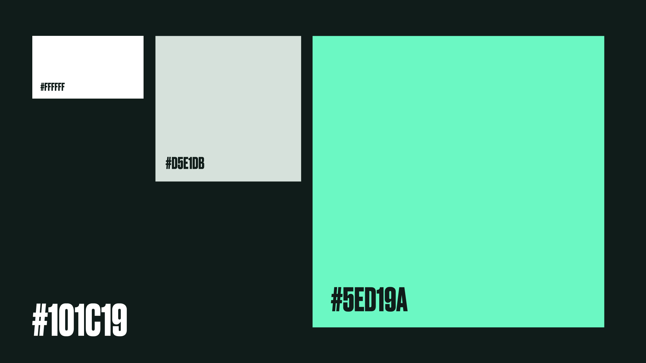
How the colours were selected
For NATTER’s colours, we chose bold and vibrant ones that stand out. We deliberately stayed away from Manchester’s typical black and yellow. Also, swerving away from red and blue, as that can also bring up a few non-design issues 🙂 The bright green palette reflects our digital nature and ensures visibility against the city’s often grey skyline, which we love to hate. Our primary colour is lively and dynamic, symbolising the energy of our conversations. Paired with a striking dark background, as most of our meetups happen in the evenings, it creates a strong visual impact.
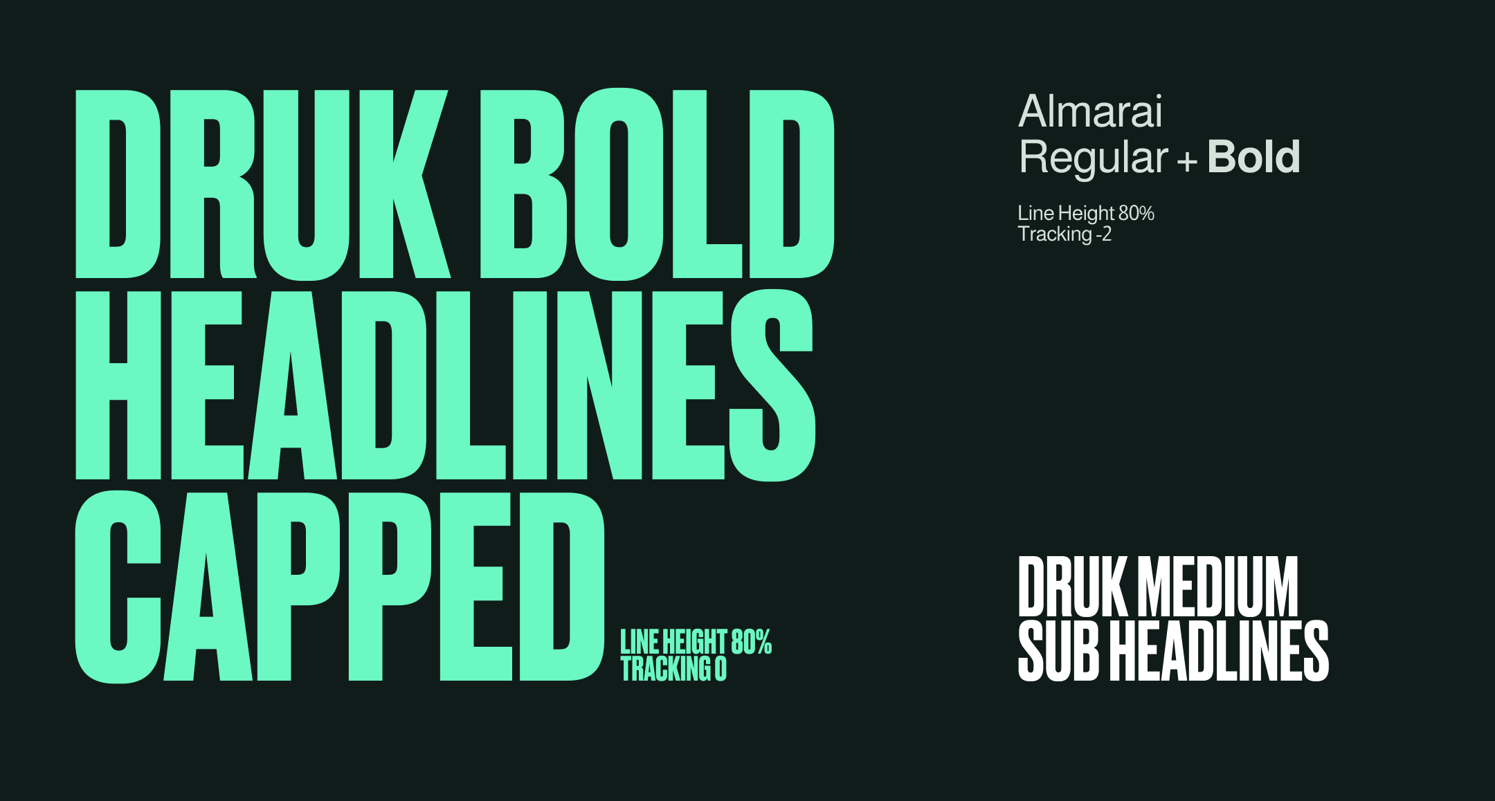
Our typography selection
For NATTER’s branding, we chose DRUK as our headline font. Its impactful style perfectly complements our more condensed NATTER icon, creating a confident and harmonious look. DRUK’s authoritative feel, reminiscent of city flyer posters, ensures our messages stand out boldly. Alongside this, we selected Almarai as our secondary font for its clarity and legibility, particularly on digital platforms. This pairing of DRUK and Almarai in our typography embodies NATTER’s dynamic yet approachable character, ensuring our visual communication is engaging and easily understood.
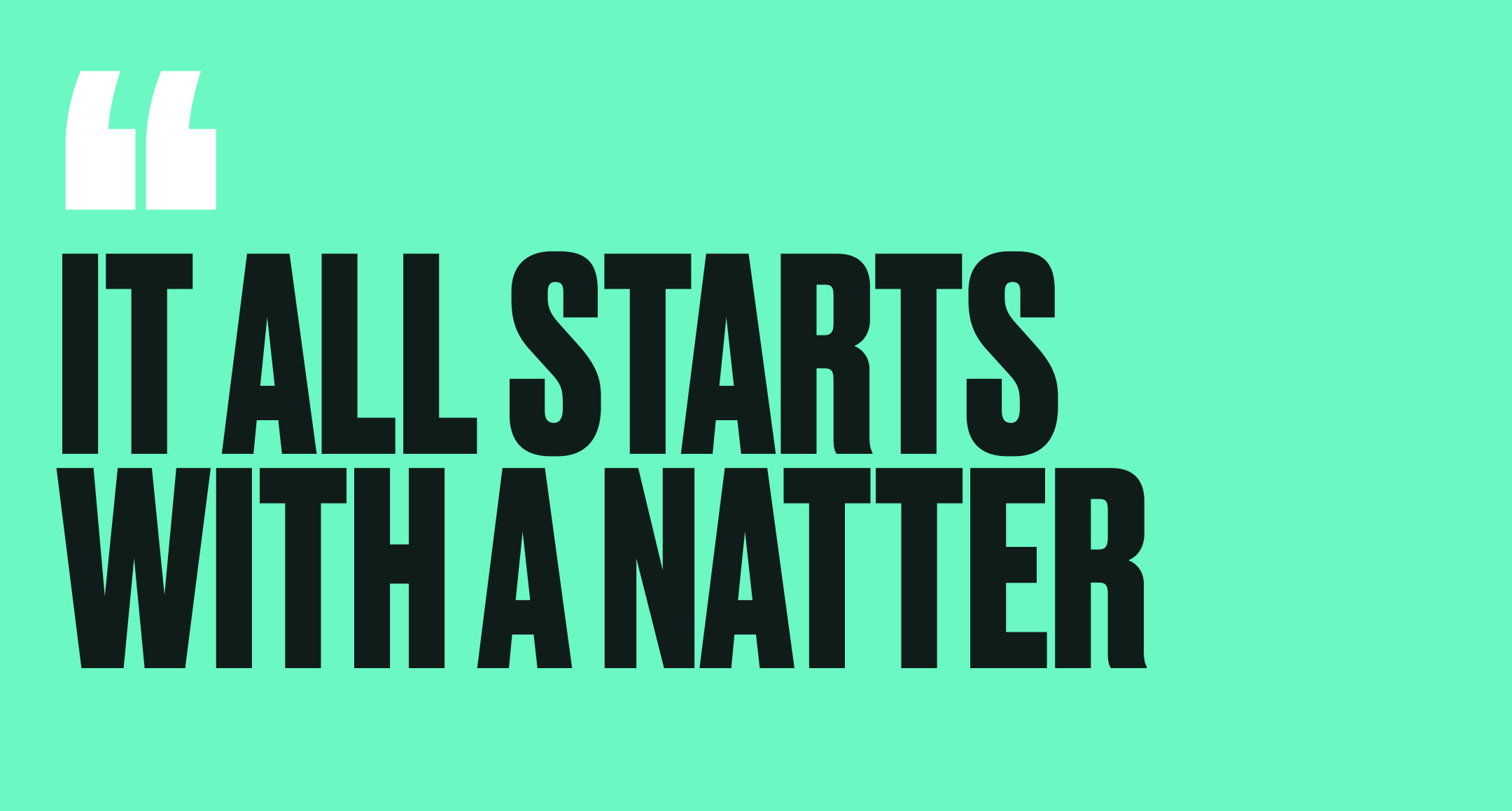
Finding the NATTERing voice and tone
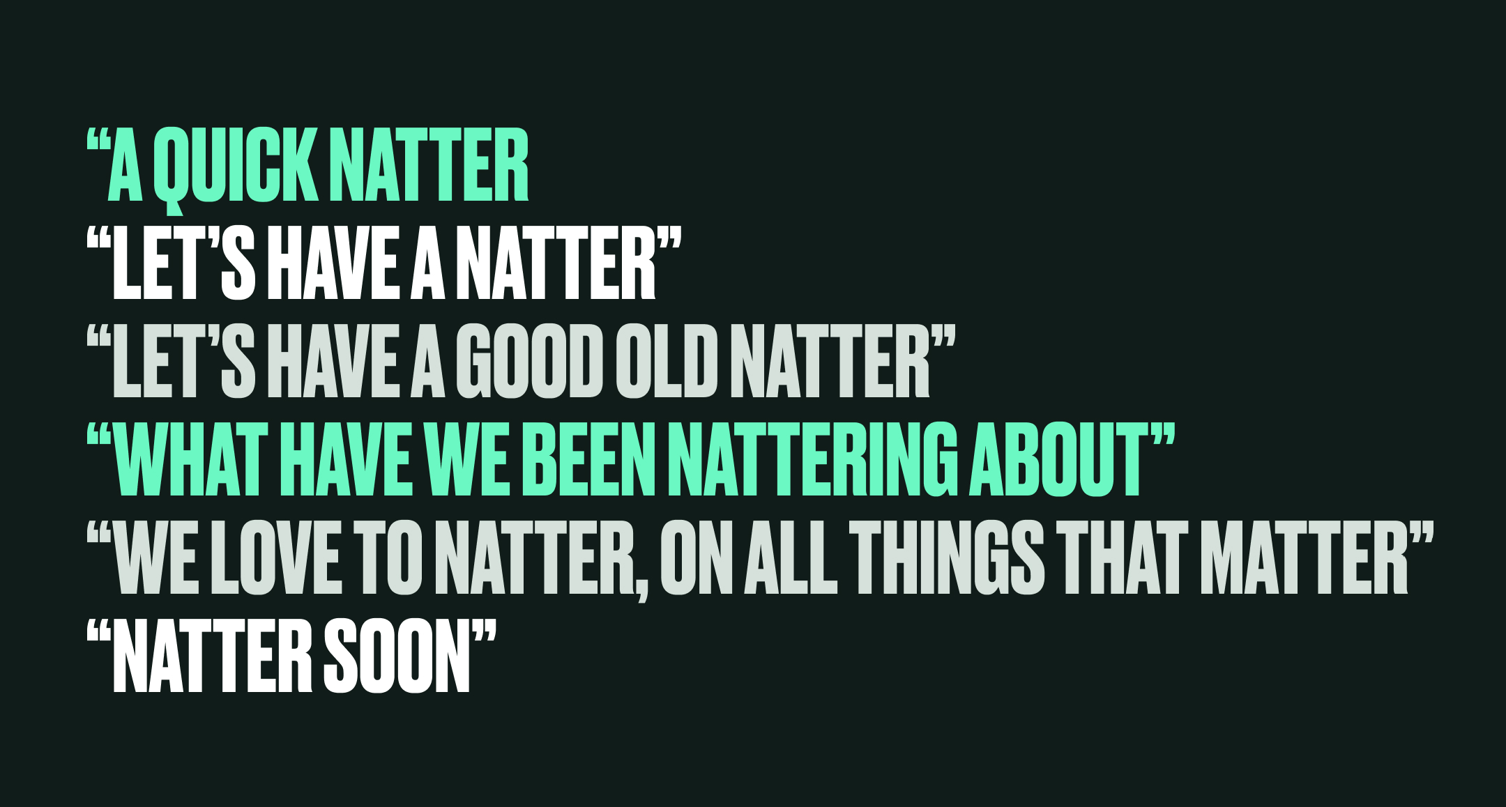
For the tone of voice of NATTER, we aimed to capture the essence of a casual, friendly conversation the kind you’d have with a good friend. We wanted it to feel natural, authentic, and free from any sense of being staged or contrived. This approachable and informal style is reflected in our choice of headlines, which invite engagement and foster a sense of community. Phrases like “It all starts with a natter,” “A quick natter,” “Let’s have a natter,” “Let’s have a good old natter,” “What have we been nattering about,” “We love to natter on all things that matter,” and “Natter soon” encapsulate this spirit. These lines are more than just words; they’re an open door to conversation, welcoming everyone into the NATTER community.
A pattern of sounds
In developing NATTER’s branding, we were inspired by the energetic movement of sound patterns and waves that Manchester is famous for and something we wanted to bring into the brand identity. This inspiration influenced our use of the logo, which we stacked in various patterns to create versatile designs for backgrounds and content framing. These patterns, scaled differently, echoed the rhythm of the sound waves we admired. We also varied colours within these patterns to add depth and enhance visual appeal. This approach resulted in a dynamic and engaging visual pattern for NATTER, perfectly capturing the spirit of our community.
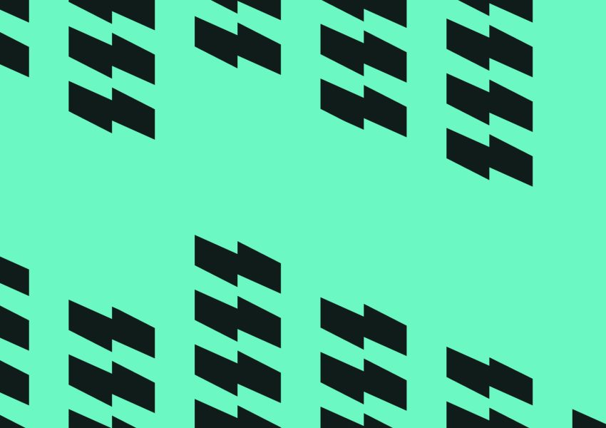
Ability to adapt to create endless patterns that can be used variety of needs.
How it all comes together
NATTER’s brand design is purposefully flexible, designed to adapt seamlessly to a wide range of needs, both digital and non-digital. This inherent versatility ensures that as the community grows, the brand can evolve with it, staying relevant and effective in all contexts. The debut NATTER event demonstrated how all the brand elements come together, crafting a cohesive brand language capable of engaging in any space or place.
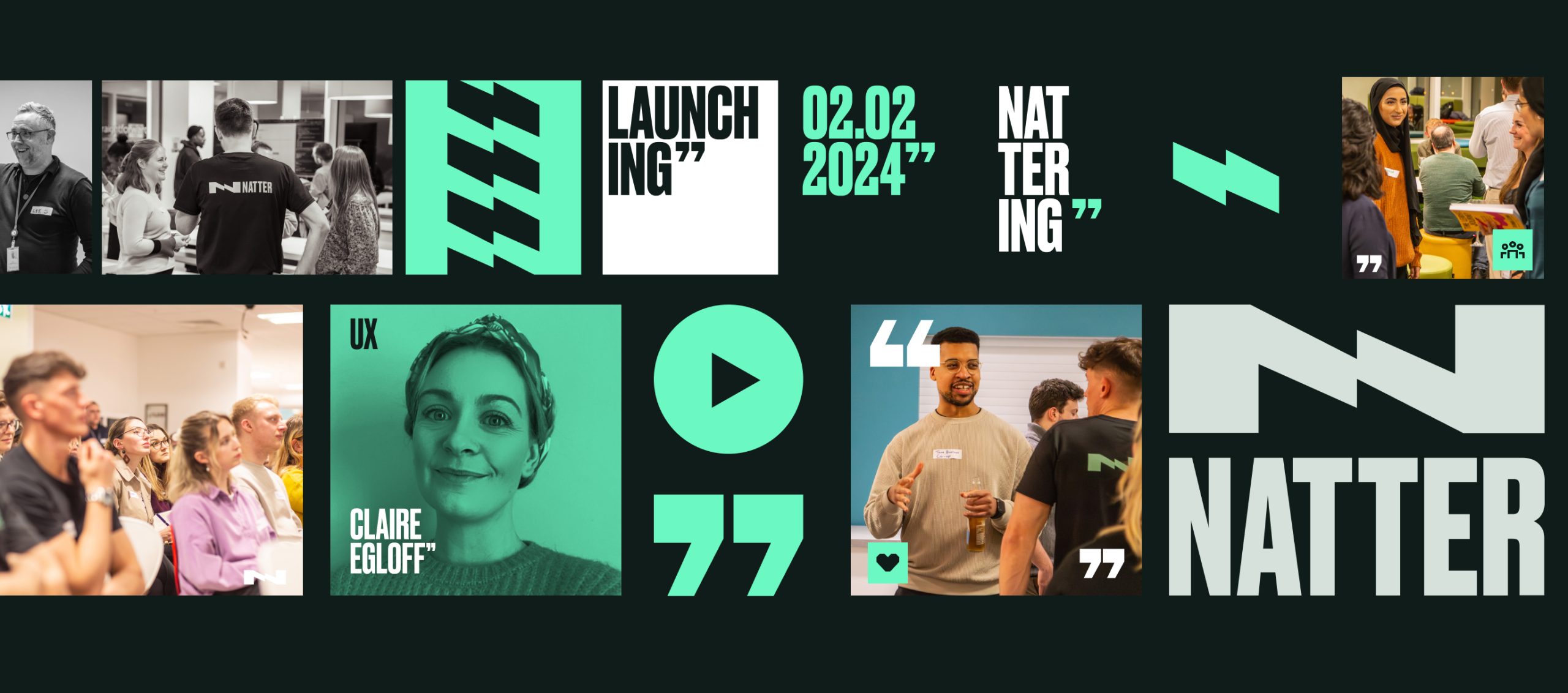
An overview of the brand language and how it was used in the first event.
For anyone looking to attend any of the future events, they can be found on the meetups page.